Monday, December 16, 2013


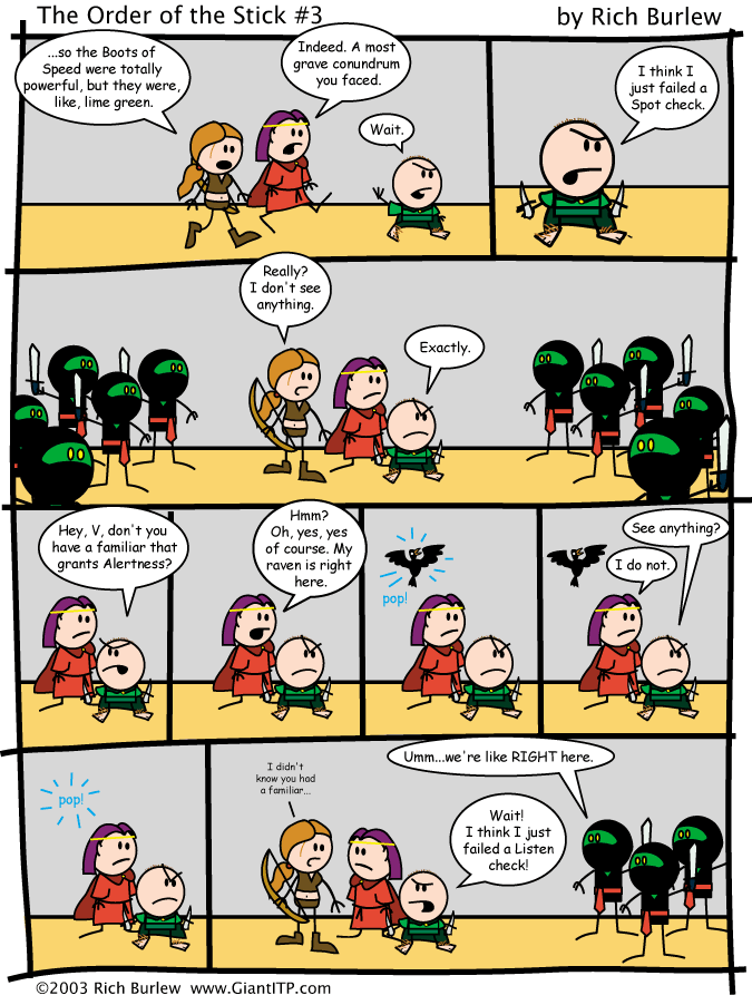
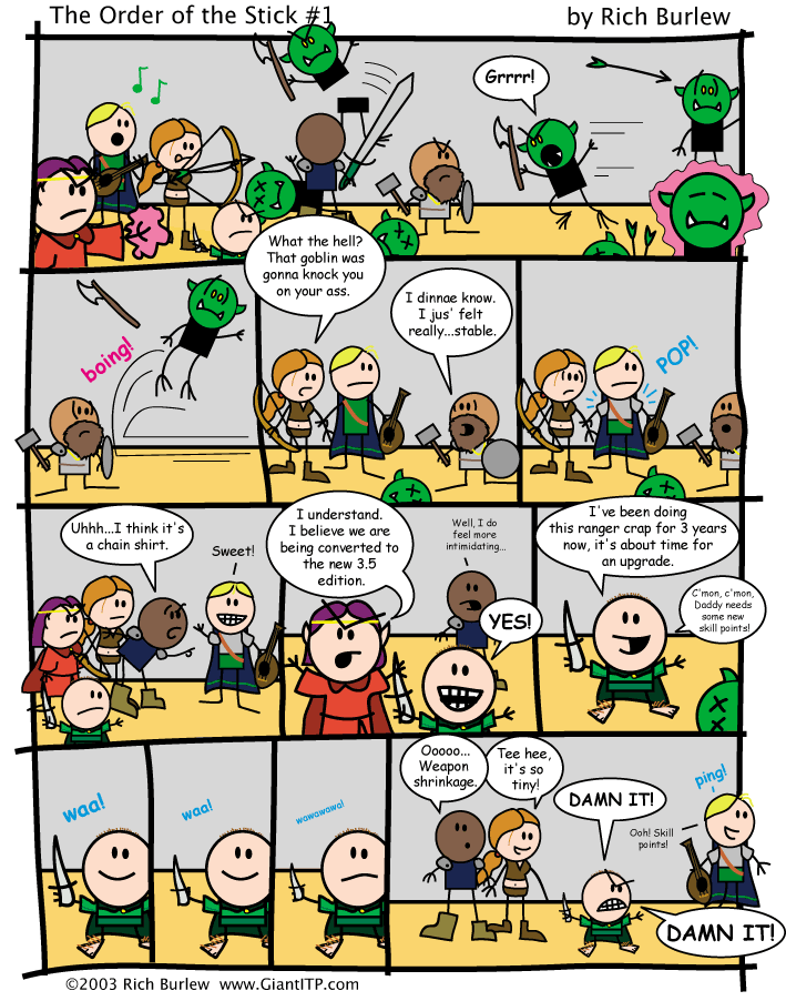
For my final comic blog, I'm doing the Order of the Stick by Rich Burlew.  I've seen panels of this floating around the internet for years, but I never read it in context until this week.  I was surprised by how much I liked it, I think the simplistic drawings kept me from looking into it sooner, but after picking out a few pages for this post, I went back to the beginning of the comic and read the first 90 pages.

I found it interesting how each page could be a self contained story, and yet there is an overarching plot, and what happens in the end of one page carries over to the next.

As for the art, one of the first things I noticed was how the box was not a perfect rectangle, it seems to be expanding in the middle, and the inner panels aren't always straight either.  The second thing I noticed was how the speech bubbles often expand outside of the box.  I think that for this particular comic that works because the characters often reference the fact that they're in a comic, so it doesn't seem as weird as it would in a more serious comic.

Monday, December 9, 2013

This week I'm doing a Garfield comic by Jim Davis.

I've never read a Garfield comic before (Though, of course, I was familiar with the character from pop culture).  I never realized how much of a jerk Garfield was.

One thing that surprised me about this comic was the punchline.  I was expecting the ball to explode, not inflate Jon's head.  I also noticed that the text is entirely made up of onomatopoeia and none of it is in speech bubbles.  Also the text in the CLAP panel is made more interesting because of its color.

Another thing I thought was interesting was the addition of a third character in the last panel.  Having her reaction to the event really sells the punch line.

Monday, December 2, 2013

This week, I'm doing The Lion, The Witch and The Wardrobe graphic novel, abridged and illustrated by Robin Lawrie. (based on the C.S. Lewis book)

The first thing I noticed about this comic is how much text there is, most comic books have mostly pictures and text, but this one has a lot of narration.

The second thing I noticed is that most of this text happens in the white space between the panels, and the panels just kind of trail off, only a few of them have clear borders.

Every page does have a border and the speech bubbles all have borders, even during the conversation between Lucy and Tumnus.

Another interesting place with the speech bubbles is when Aslan speaks off screen, and the bubble goes onto the next page.


Monday, November 25, 2013

This week, I went to the Museum of Science and Industry and saw the Treasures of Walt Disney Archives exhibit.  I have been to the Disney Family Museum in San Francisco twice before, so I didn't learn anything new about Walt Disney from the Museum, but the Family Museum cuts off when Walt Disney died in 1966 whereas this exhibit continued and had things from more current films.

This exhibit also had more production elements, including the books that open Snow White, Cinderella, and Sleeping Beauty and the costumes worn in Enchanted. This exhibit had a scale model of the Multiplane camera but I saw the real one in the family museum.  There were also a lot of production papers, including concept art and storyboards.


I thought the exhibit was fascinating.  Being a Disneyphile already, I was very interested to read and see everything.  It was especially interesting to see some of the maquettes and other figures.  I also liked seeing the behind the scenes work of the films and shorts, especially the earlier ones, like the Alice shorts.  I've watched them on YouTube but it was different seeing them on a large scale, getting to see other patrons' reactions.

Monday, November 18, 2013

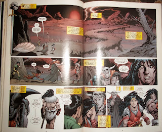
This week, I found the Wonder Woman comic Ends of the Earth by Gail Simone, Aaron Lopresti and Bernard Chang. I think it's a graphic novel, at least that's what the library classified it as.

I've never read a super hero comic before so it was interesting to see where these well known characters originated.  I was a little confused at the start.  I guess they expected that only people already familiar with Wonder Woman would read this.

I was surprised to see how it used boarders on some pages.

and sometimes used interesting gutters


Even when it has a regular gutter there are some panels that are marked with special icons like swords and skulls.


Monday, November 11, 2013

This week I found a comic called Theater Hopper by Tom Brazelton

When I first found this I thought the text was funny, but then I noticed that the artist didn't include any gutter, just a thick border.

I also noticed that the color of the wall changes from panel to panel.  I thought it was interesting to see how the artist handled the use of a copyrighted character.  Since I haven't seen this comic before, I'm not sure how much the character changed.

The last thing I noticed on this comic was that even though the camera angle remained the same through all the panels, the zooming changed to add a little variety.

The Simpsons, Homer Simpson, DVD, jaundice, yellow, vitamins

Monday, November 4, 2013

This week I found a newspaper comic by Brian Basset called Red and Rover.

Of all the comics in the newspaper this week, this one jumped out at me because of its unusual paneling.

The way it's structured and the way the dog is facing in each panel lead to confusion in whether he is coming or going, communicating the idea that he's been doing this for a long time.  I also noticed how most of the panels are blue, except for the really orange one.  That one panel helps set up the idea that it's getting late.  The green in the first and last panels also helps the viewer know where to start and stop.

Monday, October 28, 2013

This week I chose to do HergĂ© and the Adventures of Tin Tin. I know a film version came out recently, but I didn't see it, however that is what created my interest in the comics.  I looked them up shortly after the movie came out and I remember reading a few online, though after i started classes I stopped reading them.

I've always liked a mystery, so it's not surprising I enjoyed this. 

One thing I noticed about the comic was that all the panels were regular, rectangles, no overlapping ones or diagonals, any yet because of the variety in panel size and shape, as well as the detail within the panels, it feels more dynamic and visually interesting.

I also noticed that he used a lot of text in the panels, mostly dialog.    I know this is an older comic, back when people actually had attention spans longer than 30 seconds, it it was still surprising to see how much of the story could be told just through spoken words and images.


Monday, October 21, 2013


For this week I chose one of the newspaper strips I found last week, this one by Charles Schultz.  All of those, including this one, were found in my mom's box of newspaper clippings.  This one in particular is her favorite.


I have hardly read any newspaper comics before, and of the few I have read I don't think any of them were peanuts, so this might be my first experience reading the comics.

compared to the graphic novels we've been looking at and the action comic books, this one seemed pretty boring at first.  I noticed how the top half is a mirror in framing and panel placement of the bottom half.  The shots are all fairly stagnate, but that actually helps draw attention to the part that is changing, the snow.  If the framing were changed too much, I might not notice how the weather was differing.

The speech bubbles also help to break up pattern a little.  While the panels with speech bubbles are mirroring each other the sizes are not, making the comic more interesting.

Wednesday, October 16, 2013


Got five newspaper comic strips, all from printed newspapers. 

Monday, October 14, 2013

This week, I chose Manga artist Naoko Takeuchi and her work Pretty Guardian Sailor Moon.  I remember the TV show from when I was a kid but I never really saw the Manga it was based off of until recently.
One of the first things I noticed about it was how some of the panels had different boarders.  I never would have thought about doing anything besides a solid line, but I can tell just from looking at the page that the different boarders are helping, particularly in the bottom right corner where the jagged line goes with the cat scratching.

I also see how she used diagonal panels to help show action.  And, though it's hard to see in this picture, I noticed how the backgrounds are often made up of the pattern technique.  Very rarely are the actual environments drawn into the frame.


Monday, October 7, 2013

I saw this exhibit a few weeks ago, but it took me a while to collect my thoughts on the matter.  I am not much of a comic reader in the first place, knowing very few mainstream comics and probably none of the underground comic artists.  I had never seen anything like this before.
I can’t say I really liked it; the images seemed too real and the fragments of story didn't make much sense to me. Part of it might have been because they were fragments, perhaps if I had seen the entire comic I would have understood it, but I’m still doubting I would have liked it. (yes, I saw they had comic books, but I chose to spend my time looking at the images on the wall, since there was no chance I would be able to access those at home.)
I didn't feel that way about every comic on display though, there were a few I liked but overall everything was just a little too weird and realistic for me.
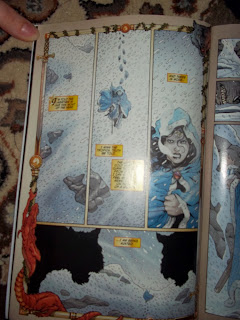
The image I chose to analyze was a panel from mosquito, and I did not realize until I got home how out of focus the camera was.  I picked this image because it seemed to be a one page story, so I didn't worry that missing pages would change my understanding.
 The panels have nice flow, I was never confused about what came next, but the content of the panels confused me.  I’m still not completely sure what’s going on, it seems that a boy is complaining to his brother about a sister, but I didn't get that until I reached the last panel, because of the way the main character is drawn, I wasn't aware that he was supposed to be a child until I got to the part about a sister, which confused me because I had assumed that he was an adult at first.  The dialog also seemed more like an adult talking.  Also, I have no clue why Clowes chose to title this Mosquito.
 I agree with Clowes that the art is in the books, not on the wall.  For one, if it’s in a book, you get all the pages, and context of the story.  Two, the way you read it changes. Looking at the art on the wall I was trying to see meaning behind it, and understand it, far more than I would have if I had picked up a book at home.  With a book at home, I would probably not be expecting much, so the parts that I did like would have stood out more.  Also with a book, I could reread it as many times as I wanted, and let the parts that did make sense sink in and return to the rest later, as opposed to seeing them at a museum where I felt rushed to see it all, even spending hours there, I did not have time to really formulate a cohesive opinion.
Since the books are the official art, that would make the stuff we see on the wall rough drafts.  Even when the drawings are complete they can’t be understood the way the artist wanted them to be until they are put into book format. 

Having the book as the art object, it changes how art travels, and who art influences.  It makes it so even people who do not consider themselves interested in art (those who would avoid a museum at all costs) able to be influenced by art.  It makes art accessible to everyone, not just those who can get to museums or galleries.
Monday, September 30, 2013

This week's comic: Archie's Double Digest #172 by Stan Goldberg and Bob Smith

This comic has been sitting in my closet since I was about fourteen, but I don’t think I ever read it before.   Maybe once right after I got it, but I certainly don’t remember any of it.
Rereading it after all this time made me notice things in it that I wouldn't have before, like how even a simple story about going to a fair can use a lot of variation in the panels.  I also noticed how sometimes the characters and speech bubbles popped out of the frame. When we talked about it in class, I would have assumed that that was mostly used to show action or breaking the forth wall, but the way it's used here I noticed how it added more depth without having to draw the background in again.


I also almost missed places where the panels are just dividing up a location to show passage of time; only when I got to the last one did I realize that the backgrounds were interconnected.

Monday, September 23, 2013

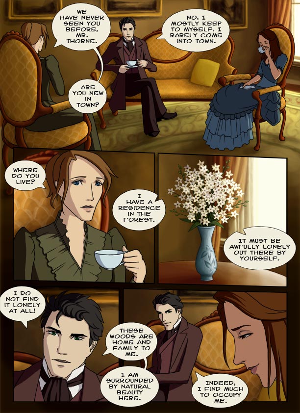
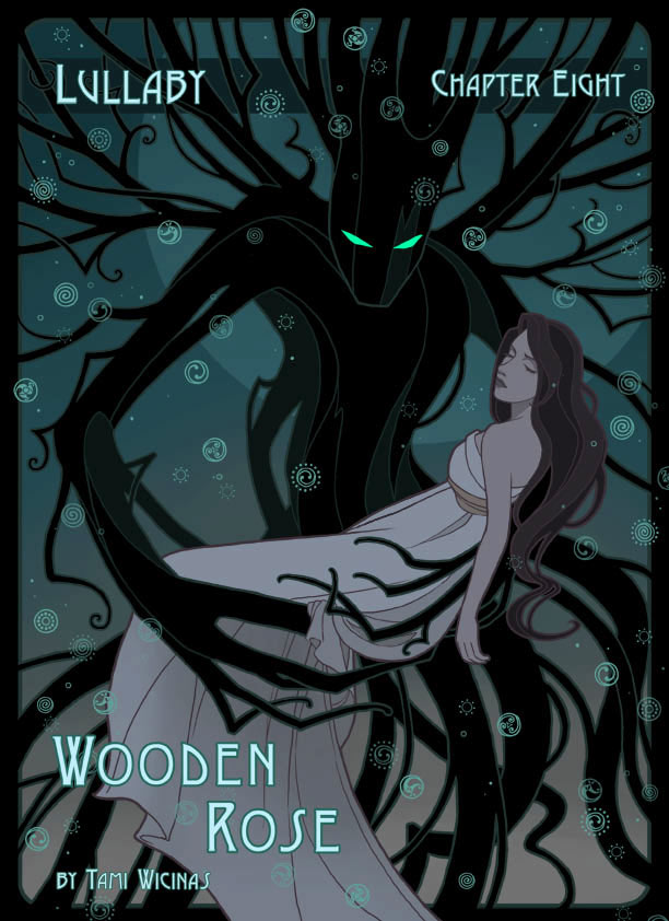
This week I chose Graphic Novelist Tami Wicinas and her first graphic novel, Wooden Rose. Originally published as a web comic, Wooden Rose has now gone to print this summer, thanks to Kickstarter.

I actually first came to this comic before it was finished, all thanks to seeing one panel on a different site.  I was attracted to the bright colors and Victorian setting. At first it seemed to be a normal Victorian romance, and there really is a lot of romance in it, but then throw in a plant demon/half demon, a middle ages dream forest and those fantasy elements really made this comic stand out to me.

Overall, it isn't very actiony, there are a few moments, but the emphasis is really on the healing after.


I probably would have liked this even if it had turned out to be a normal slice of life story, but the fantasy part of it really pushed it to the max, its everything I love all in one.  The only thing I wasn't completely satisfied with was the end, which is only because it was somewhat bittersweet. I tend to prefer happily ever afters for all..

Monday, September 16, 2013


My initial reaction to the article on the Harley Quinn Comic is not outrage at the nude female, but rather the premise of this and suicide as part of a contest.  If this had been featured in a comic in full, it probably wouldn’t have caused such a reaction. For one, because I doubt she would succeed in her death, and two the rest of the comic may have addressed the seriousness of suicide.  The way they cut it off, people may assume this is promoting suicide, even if DC did not intend that, some amateur artists may see it that way and draw it in a glorifying manner.  Whether or not DC picks these images is irrelevant, they are bound to end up on the internet and younger fans of Batman may find them.
As for the naked female character, it does seem tasteless to ask for it in a contest open to everyone, but I can’t be bothered by the fact too much.  Because of the prevalence of the internet a naked woman is no longer that unusual, frankly it would have been more shocking if they’d asked for a naked man.
About the objectification of women, while it does exist in some places, I’m more inclined to think its prevalence in comics is less because women are truly undervalued, and more because comic book superheroes (at least the mainstream ones) tend to be straight men.  The women sometimes seem objectified, but maybe it’s just because their side characters are often love interests whose sole role in the story is to make the hero feel something.  If we had more female superheroes, maybe men would be the ones who were objectified.

The only way true objectification will be avoided is if people stop buying the comics that feature it.  But as comic artists, we can try to give more characterization to women and avoid unnecessary exploitation. 

Monday, September 9, 2013

For this week, I chose Manga artist Monkey Punch.  I first learned about this artist when I was researching Hayao Miyazaki, and found out that the first film he directed was an adaptation of Monkey Punche's Lupin III manga.  Because I liked the film, I decided to seek out the manga.  The first thing that surprised me about this was the adult content.
While I had heard of adult oriented comics and cartoons before, this was my first real exposure to them (not counting the Simpsons).  What surprised me most about these comics was the way wacky antics blended with sexual and violent themes.

The style of the manga is far more graphic and sketchy than I’m used to and some of the panels jump around, so much that it’s hard to be sure of exactly what is happening until the end.  At least in the early ones that I've got, the characters aren't drawn consistently, further confusing the audience, although the end usually does clear it up. 

 There tends to be a lot of variety in the panels; not surprising for a comic that has little continuity.  The panels also lean towards more intense.

Tuesday, September 3, 2013

The writer Stefan Petrucha and artist Sho Murase are credited as the makers of the Nancy Drew graphic novels, at least the ones I own.  I don’t know much about their other works; I only really came to the Nancy Drew ones because I was a fan of the 83-year old character.
I have to say the comics impressed me more than I expected them to.  About a decade ago Stratemeyer Syndicate (or whoever owns her now)  updated the character in an attempt to give her more flaws and make her more 'realistic', but it came across as ruining the character I loved.  The comics brought her back.
They kept the new flaws, but the addition of images changed my perception of Nancy. Rather than the new books where Nancy specifically says she notices something important and then never mentions it again, the graphic novel shows the important clues, but because the reader is a third point of view, I find it easier to believe that Nancy might have missed it, rather than aggravating me when I solve the mystery in chapter two and then have to wait for Nancy to catch up in another ten chapters.

The pictures I used are from The Haunted Dollhouse, my particular favorite because of all the bonus imagery thrown in to celebrate Nancy’s 75th anniversary, not to mention a good chunk of the dialogue is attempting to work in the titles of previous books.
The book's plot and writing still aren't as good as the old mysteries and I’m not overly fond of the character designs. If I were asked to make a Nancy Drew comic this wouldn't be how I'd do it, but considering how bad the new books can be, I'm glad they found a nice blend that can appeal to the fans of the old and the new.


The comics don’t have a lot of variation in the panels, except in the really important scenes, or really action heavy scenes, but this adds to the mystery, helping the reader determine when important clues are shown.

Another thing I like about the comics is the way they can mimic the creepy atmosphere of the old books.  The newer text only books took out the ghost effect and replaced it with action packed pages. It’s nice to see the comics keep both creepiness and action.